Dream Home Construction Website Redesign
Dream Home Construction, one of our longest-standing customers and award-winning home builders has a new website redesign to boast about built by Novagiant. In the world of website design things can change rapidly. I’ve always said every three years is a good time to review website framework and design. Not only because things change rapidly but because It is important to stay focused on new ways of improving the user experience.
We’ve made several revisions to dreamhomeconstruction.net over the years since 2007. I visited the internet archive and pulled a few snapshots from the Wayback Machine and wow – what a difference the World Wide Web has gone through.
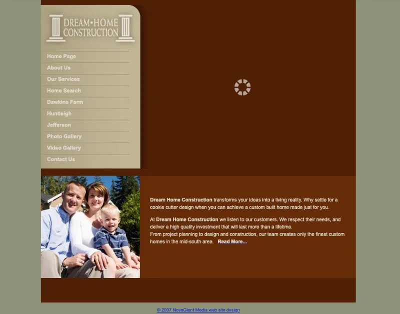
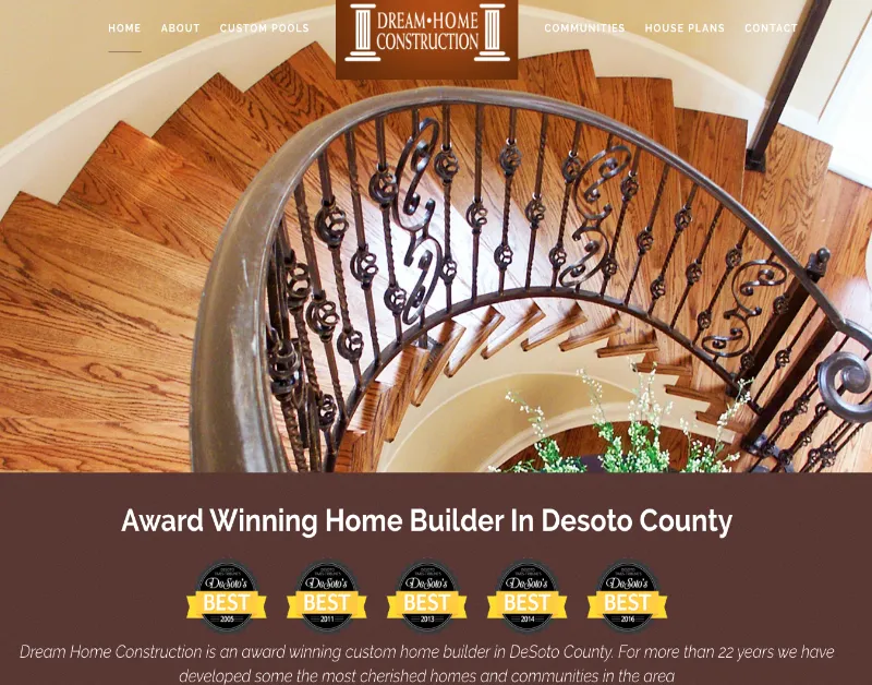
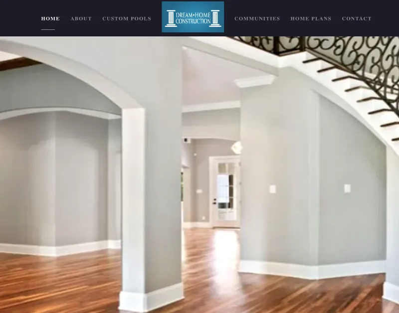
2018
Some of the content from the archive didn’t load as seen in the screen captures above but it was definitely entertaining to go back almost twenty years!
Maximizing The Elegant Custom Home Photos
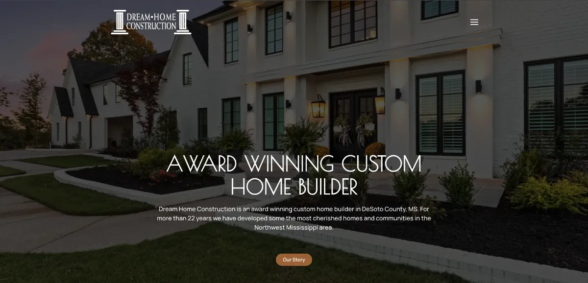
Photos are worth a thousand words, so for the 2024 website redesign version we’ve extended the showcase in the top of the website to fill the entire view top to bottom, and left to right. Also bringing the photo container underneath the header and setting the menu to toggle, removed any clutter. Clicking the toggle then opens the menu in a modular overlay, instead of using a traditional method. This works very well on mobile phones in portrait mode. Finally, the viewport was set to the full height of the device so that no matter what device the user is on, it will always fill the space and look amazing!
Adding Horizontal Parallax Effects on Scroll
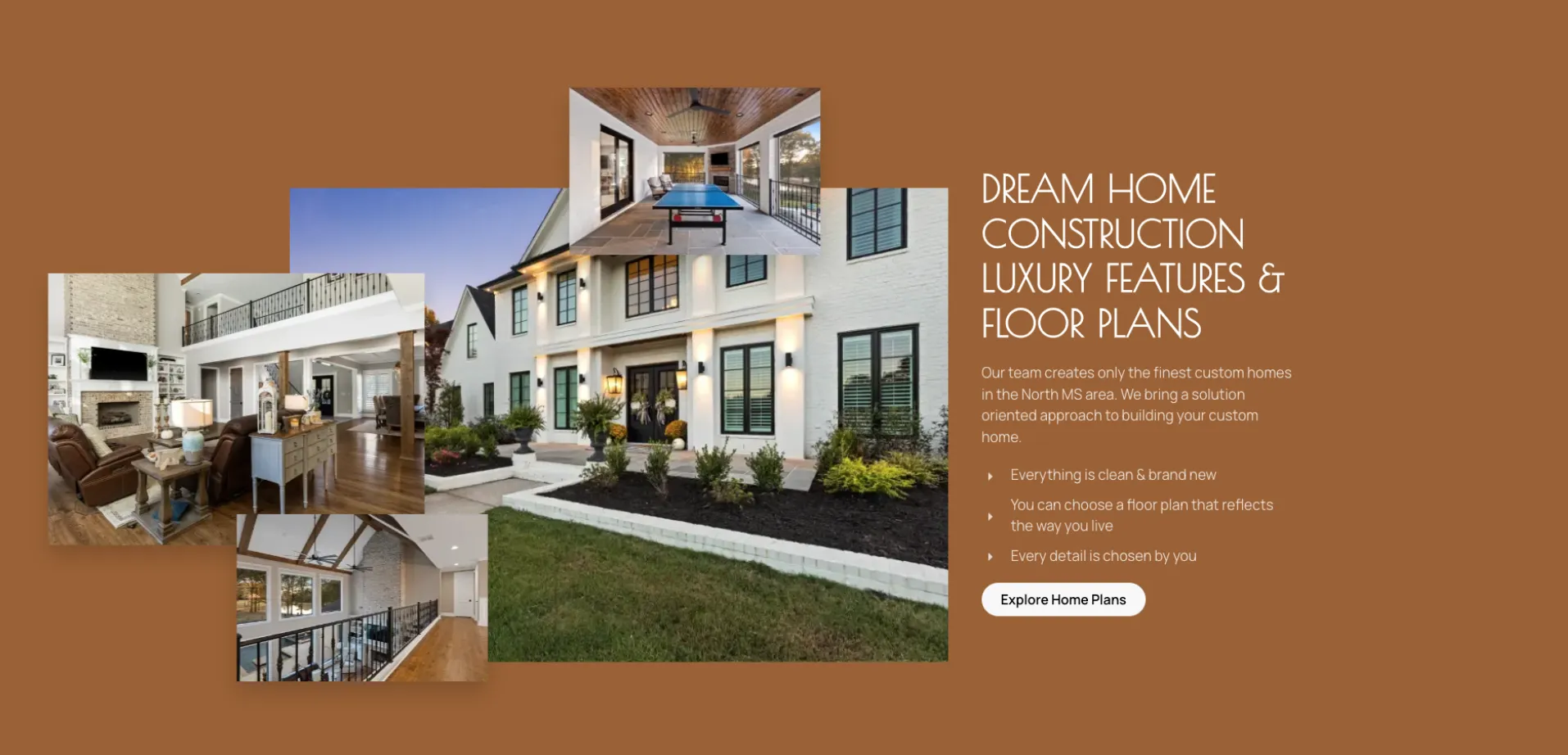
We wanted to have a creative way to place photos in the view as the user scrolls down the page – but without cluttering up the layout. One idea we came up with for this website redesign in section four was layering the photos and setting them to slide in at different intervals. This creates a nice effect while balancing the visual load as the users scroll targets that section.
Content Focused On The Quality Of The Product
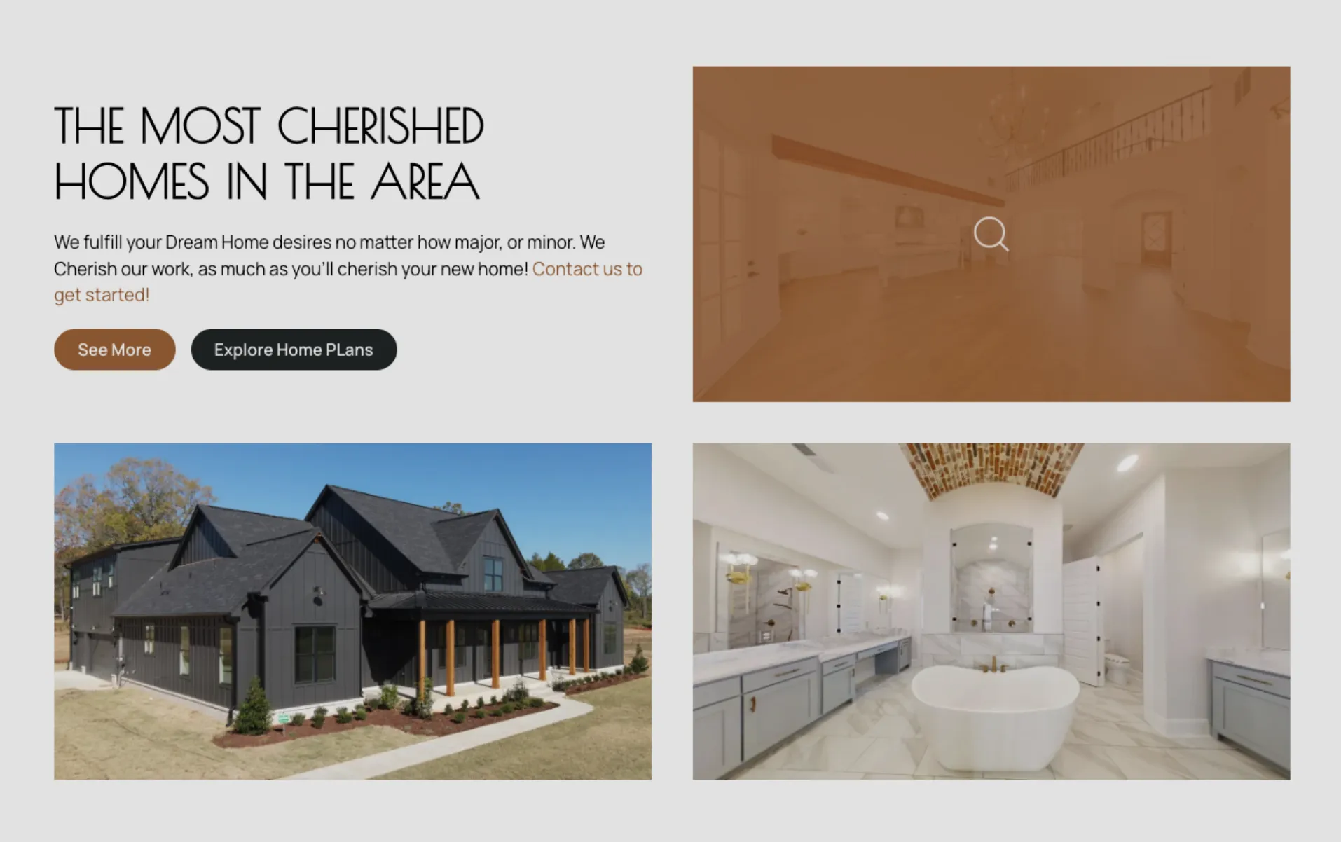
The content was kept to a minimum for this page. The product is good enough to tell the story and keep the user engaged. Our goal – answer the questions: (a) why is this builder the best in the area, (b) what kind of custom home construction work they do, and (c) how can I contact them.
See the website in action here: www.dreamhomeconstruction.net
Website Redesign Conclusion
This project had some challenges but was incredibly fun to work on. Seeing everything come together is worth the time and effort. However, the best part of working in creative design is when the client notices the effort and is happy with the result. Because there is a lot that goes into every custom website we build from the HTML and CSS to the handling of scripting code. It is always a great feeling after finishing a website that feels like you’ve accomplished something great.
Looking for a website designer near you?
Contact Novagiant for a free web design consultation! Send us a request now.
Design Categories
CONTACT US FOR A FREE CONSULTATION
It only takes a second and we will be so glad you did!
Free Consultation